Chipotle
The Chipotle Restaurant has a very unconventional menu system. There was nothing to hand out, it was all written on banners hanging from the ceiling behind the counter. Admittedly it was a little unprofessional, giving away some information about their pending liquor license and the soon to be margarita's. I found this to be "unprofessional" because to me, that type of information doesn't belong on a menu!! The menu was also very small, with just a few options of meals to get. However once you made your choice you could customize it while they were building your burrito or taco, by choosing what to put inside it! Unlike most restaurants with a lot of choices but little customization (such as rare, medium or well-done on meat), this restaurant had few choices but tons of options (what type of rice and beans? chicken? hot or mild? etc etc).
Overall I liked the system, it felt really casual because of the blithe posters regarding their liquor license and also because of the interaction with the person preparing your food as you chose what you wanted on your food.
-Donato Borrello
Thursday, September 24, 2009
The Biased Bistro Menu (Parish)
To prepare for the upcoming project--after having becoming increasingly disenchanted with other campus cuisine--I decided to treat myself to lunch at the Meliora Resturant. This on-campus dining gem went undiscovered by my fellow freshmen and I until later in the second semester, but provided a respite from the fried, homologous food of Danforth, The Pit, and Douglass.
Last week, I went in opened the menu, gave it a quick perusal, and instantly ordered the Meliora Burger. I came to the conclusion that the menu hadn't influenced my ordering at all. I had known a priori what I wanted to order before I even entered the resturant. An important personal bias (and possibly a general trend to investigate) to reconcile when conducting further study into the design of an ordering system.
Understanding My Biases
I went to the Olive Garden the other afternoon for lunch with a group of friends and tried to keep in mind the goals of this exercise as I ordered lunch. I found that this was perfectly exemplary of bias, since the only reason I usually go to Olive Garden for lunch is for the unlimited soup+salad+breadsticks combo. As such, I usually won't even open the menu, unless I'm feeling particularly bored. Similarly, whenever I eat at a place like Olive Garden that doesn't really have a very dynamic menu offering, I often know what I want by the time I'm sitting down, and the only variety I'll introduce is in my wine or beer choice, it seems.
Thus, in designing a new menu system, I think it's important to keep in mind users who might only order from a limited range of the menu. In essence, I think it's important to determine a presentation of menu items that affords the most natural ordering and grouping of menu items so that people can quickly jump to sections which they might be familiar with. However, I also think that it's probably important to maintain some presentation of "special" or new items that the restaurant owner might want to promote.
ihop


- Well organized
- Nice color scheme
- Good variety
- Top sellers of each category were always shown first
Bad thing
- Too big (it was about 8pg)
- They should have had more pictures of the food
- The edge of the menu gave me a paper cut
Final Grade
- 6 out of 10 (that paper cut brought the value from a 9 to a 6)
Blog Post #1

I went to John's Tex Mex Eatery to do an observation for assignment #1. This outing exposed some of my biases and habits in a restaurant setting.
First, I rarely order a drink other than water. So when the waiter is giving the drink options, I usually don't pay attention. Therefore, it is possible that during the interface design process or during my observations I might glaze over some important aspects of the drink ordering exchange.
Second, when I finish eating I usually move directly to the matter of paying the check. However, many people don't think about it until the waiter brings it to the table. Some people feel pressured to leave when the check arrives; I simply feel that it gives me the option to leave. Perhaps the restaurant system should have a "bring check" option. This would allow people to get the check when they wanted it.
Recognizing these biases should help with my remaining observations and design suggestions.
Nate Snyder
Wednesday, September 23, 2009
Exercise 1 - Understanding Biases (Barry)
My choice of menu restaurant is Wok with you at Park Point. I don't like how they distribute their menu. It has 3 separate menu consist of menu for main menu, sushi menu and drink/desert menu. The reason why I do not like it is because sometime it only gives 1 menu for sushi per table and we have to request for it if we want more menu for sushi. Won't it be easier to just put it in one menu? Also I think that me and my friend usually decide on what we should have for drink first before eating so it would be best to have the drink menu at front. When I first come to this restaurant, I was browsing looking for drinks, just to found out that it was on a separate menu! They also do not state what soft drinks they have.
Secondly, I think the menu is also very plain and lame. It has no picture associated with the food at all even though it has varieties of food like thai food, chinese food, dimsum and sushi. The font are small and the spacing of the words seem to be close making it look messy and harder to read. Sometimes the menu has a lot of redundancy word.
So usually, when we come to this restaurant, we already know what we need to buy because we do not want to be bothered by the poorly design and unattractive menu.
Ordering Bias
Even before I got to the restaurant I had an idea of what I wanted to eat and so my goal when first looking at the menu was to find if they had what I wanted to eat. In design, this could be accomplished by using some sort of ingredient picker to find items that might have a flavor you are interested in. Also it is important that when you first sit down the waiter takes your drink order first so if you have a digital menu you should be able to make your order as soon as you sit down. Also when the menu items aren't accurate or clear enough you have the option to ask the waiter. Lastly dessert is almost always ordered AFTER the meal so it is important that menu not turn off and not be usable again once you order.
James J Regan IV
COO Emeritus Consulting
B.S. Computer Science
B.A. Linguistics
University of Rochester
Class 2010
Exercise 1 (Bin Bao)
I had a lunch in Soul Garden this Monday. It is not surprising that having lunch in a non-fastfood restaurant is quite different from having a dinner, especially when the restaurant provides a Lunch Special menu. People tend to order from that special menu, because the food is usually cheaper and faster. When designing a menu system for our assignment, I will not consider this special case, unless have extra time to extend it.
Based on the experiences my friends and I have, I plan to target my system to a Chinese restaurant. In terms of biases, I have the following items in my mind:
1. Most of my friends are just graduate students, who are probably sensitive to the price.
2. As a guy, I think most guys are more interested in ordering meat.
3. People like to ask their friends for suggestions when ordering.
4. People like to order the recommended food from the menu.
5. People like to order food with pictures.
Exercise 1 - Understanding Biases (Garrett Hall)
I chose Taco Bell as the restaurant chain to study. After visiting one of the locations, I realized Taco Bell has the following advantages:
A) All my friends are familiar with the menu which will reduce bias of my order affecting their order.
B) Menu items are close in price which reduces the bias of the price of my order affecting my friend's order (which happens—I don't order filet mignon if everyone else gets cheeseburgers).
C) The menu is complex enough with substitutions and combinations to necessitate some kind of ordering interface.
D) Sitting down at Taco Bell I can collect as many observations as I need to.
Ordering Tendencies
Last night I went out to Buffalo Wild Wings with some friends, and
picked up the menu. Being mostly vegetarian and completely picky, I
started looking for items that I would think about eating. I noticed
that I started with entrees, moved to appetizers and finally looked
over the side options. After making a rough list of foods I would eat
and loosely ranking which ones I wanted most, I began to discuss what
others were looking at, if they were getting a drink or an appetizer
etc. I found that the discussion that followed had the greatest impact
on which items I wanted to order (whereas the initial run through of
the menu was mostly taking things out that I wouldn't want).
-Sid
Tuesday, September 22, 2009
Good and Bad Design


Bad:
This GE toaster oven, generously donated by Grandma Snyder, makes crisp toast and delicious broiled fish; however, its controls are poorly designed.
In order to toast, you must turn the top knob to 450 degrees, the bottom knob to "Toast" and the middle knob to the desired toasting time. The flaw is that you must turn the top knob to 450 in order to toast or broil. The top knob should only be necessary when using the bake function. This was clearly a known design flaw that was covered up by the notation on the bottom knob: "Set Oven ℉ to 450". Properly designed, the top knob should only be used for the bake function.
Good:
Since we see this type of sign everyday, we take for granted its design. In an instant this sign tells me that there is a bathroom behind this door and that it is for men and not women. By utilizing a universal cultural convention that women wear dresses and men wear pants it tells us this without words. The english word "man" could be added to the sign but it really would not add any extra information.
- Nate
Wednesday, September 16, 2009
Bad Design (Bin Bao)

but is "standby". But it is so counter-intuitive, because that little
button is so widely used as symbol for shutting down in our daily
life. I once showed my vista (English version) to my cousin, and she
doesn't know English at all. She said: I don't know English, but I
know how to turn the computer off. Then she clicked that icon, but
didn't get what she expected. Well, don't challenge people's general
knowledge about the world.
(I don't have windows vista installed now, so the picture is from the internet)
Good Design (Bin Bao)

my TV as well. It automatically matches with my TV and requires no
extra human interference. It doesn't support all functions as my TV
controller does, but does have two key features, turning on/off TV and
adjusting the volume. Another key feature, changing channels, relies
on the dish receiver. This extra TV support is simple and effective,
which gets rid of the headache of switching between two controllers.
Friday, September 11, 2009
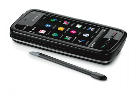
Good design

The nokia 5800 is a good design hand phone. It has a touch screen that is highly responsive and you can change the view of the screen from landscape view to portrait view. The hand phone is really light and the size is just right.
The interface is easy to navigate and it has a higher resolution compared to older model phones but it has a flaw on the gallery (they cannot separate pictures into separate folders). You can open many application simultaneously without lagging the system.
It also has quality speaker and you can use it to access the internet using WI-FI just like an i-phone. It has a good quality camera at 3.2 pixels with a lot of additional function like night mode and close up.
At the bottom of the phone you have three button which has green, white , and red colors in the middle of it. Green button can be used to call someone, white is used to open the menu and also has a notification light in case you got a miss call or a message. The red button will exit everything and go to the starting point.
Overall it is a good design and easy to use.
Bad design

Moreover, the fan makes an incredibly loud sound. This happens because the fan moving really fast even at low speed. I am a really fan of quietness so the loud sound of the fan really annoys me. I usually just open the fan at low speed because it sounded less noisy compared to medium and high speed for obvious reasons. And I even might turned it off and rather be hot then be annoyed by the noise.
This fan can also attracts a lot of dust to it. With its weird shaping, the dust got stuck in the front of the fan and its cover. It is also hard to clean the fan from outside because of the shape. You have to open it and I have no idea how to because it looks different than other fan.
Overall, I found this fan rather annoying and somewhat bad yet I am still using it because I do not want to spend more money on a new fan.
Thursday, September 10, 2009
GREAT design

This device is one of those things that you see and use every day but really but really don't come to appreciate it until you take time off and admire its simplicity. Its only has one switch to control it. The switch can be in 3 positions:
Left – for hot
Middle -for off
Right – for cold
On the top it has a handle for easy carrying and the surface and the inside is made of a material that can be cleaned very easily. Inside there is a self which you can remove to add more space. The door is very easy to use. Turning the knob will unlock it, and it will automatically lock when you let go of the knob. It's also light weight compact and cute!
Bad design


**The bath sponge which I had, looked like the blue bath sponge presented but it was modeled after Patrick star from the cartoon Sponge Bob Square Pants
It's also hard to notice bad design, when I first bought this it looked like pretty cool and I thought to myself this is a pretty nice design. But when I used it for the first time I noticed that
The eyes would scratch me.
It was made out of a weird material so it would fell weird when rub against your skin.
The Bath sponge had pants so I could only use half of it to take a shower.
Overall this product had no good points other than making bath time a complete and total pain.
By Darly Paredes
Bad Design - Donato
http://images.intomobile.com/wp-content/uploads/2007/06/sprint-samsung-upstage-m610-red-2-copy.jpg
This phone was designed to have the ability to be used as an mp3 player in addition to as a phone. To make it "sleek" and "cool" they put the mp3 player on the back, and screens on both sides! In order to switch functionality you have to press a button on the side. While I don't have a lot of personal experience with it, my mother simply can't answer the phone! My best guess is that it is stuck on mp3 player functionality (which she also can't figure out) and thus the phone part isn't allowing her to accept the phone call. She at first thought the phone was defective and had it replaced only to find that the phone is working as it was designed: poorly.
This phone was designed to have the ability to be used as an mp3 player in addition to as a phone. To make it "sleek" and "cool" they put the mp3 player on the back, and screens on both sides! In order to switch functionality you have to press a button on the side. While I don't have a lot of personal experience with it, my mother simply can't answer the phone! My best guess is that it is stuck on mp3 player functionality (which she also can't figure out) and thus the phone part isn't allowing her to accept the phone call. She at first thought the phone was defective and had it replaced only to find that the phone is working as it was designed: poorly.
Good Design - Donato
http://upload.wikimedia.org/wikipedia/commons/thumb/c/c0/Xbox360_WiredController.jpg/800px-Xbox360_WiredController.jpg
The xbox wire is one of the more clever innovations I've seen in wires. It has the ability to come apart near the connection to the Xbox. The purpose of this is to protect the user from potentially pulling the Xbox off the shelf if the user is moving too far away from it. This is actually really effective, it has saved me once already! It also doesn't come undone accidentally, it has the perfect amount of strength, I've never had it randomly come unplugged. So it was a basic improvement to a typical wire, with no perceived draw back, but with a huge fiscal benefit in protecting your expensive Xbox purchase!
Bad Design: Speaker Case (Joel Parish)

It turns out that it is a 6-step process to put the headphones into their case. It has no obvious affordances of which direction to place the headphone in, nor, that one must rotate both headphone arms 45 degrees to insert into the headset, nor that the spindle around the edge of the case is meant for wrapping the cable. The closing bar-cover only rotates one direction, but is confusing as to which, and is extremely difficult to open without fear of breaking the device.
Good Design: Volume Control for Computer Speakers

It has a large knob for volume (even labeled volume!) and a smaller knob for bass. + and - are written beneath each knob to hint at directions and a small dot is indented to indicate the knob's current position. A power button toggle pop in to power and out to turn off with a standard closed-circuit-power-button metaphor icon.
For advanced users two more options are available: plugging in a headset into the minijack with the headphone's next to it shifts output from the speakers to the headset for less-intrusive listening. Also, the mini-jack with the music note affixed allows the user to overwrite the input with an auxiliary music source (e.g. an iPod). While using either of these all the rest of the controls still function as expected, and rapid muting by turning the volume control knob is a very thing to have in dorm life!
Bad Design (Wyatt Anderson)

Quite the contrary, however, as the LG Voyager is crippled by awful, locked-down Verizon software, cluttered with too many buttons and switches, and has a clumsy, hard-to-activate touch screen which really affords no new functionality (the phone has a "hard" keyboard, unlike the iPhone, which affords much greater functionality than the piss-poor excuse for a virtual keyboard on the front of the clamshell unit).
--
Wyatt Anderson
wanderson@gmail.com
--
Wyatt Anderson
wanderson@gmail.com
Good Design (Wyatt Anderson)

--
Wyatt Anderson
wanderson@gmail.com


Wednesday, September 9, 2009
Good Design (James Regan)
High Sierra Access Laptop Backpack

My backpack is an example of a really good design. It has a place for everything that is logically placed in the backpack. For example, it has a special pocket for the laptop which has an additional (adjustable) strap so the laptop will not move around even if its the only thing in the backpack. Also, there is a pouch at the top of the backpack with a small hole which is used to put a CD or MP3 Player and have your headphones come out of the hole. Another nice feature of the backpack is that it has pockets specifically designed for pens or pencils, for a calculator and for a cellphone. Lastly a nice touch, one I haven't used often but occasionally, is there is a plastic cover attached to the bottom of the backpack hidden in a zipper which fits over the backpack and acts as a water shield to protect your laptop from rain. The reason I've not really used it is that the backpack is well designed and is pretty waterproof on its own and the water shield looks kind of ridiculous, but it is a good idea and a good design that might help sell a couple of more backpacks over their competitors.
James J Regan IV
COO Emeritus Consulting
B.S. Computer Science
B.A. Linguistics
University of Rochester
Class 2010
Bad Design - (James Regan)
The George Foreman 360 grill:
This grill has an overall good design but parts of it just fall flat and make it frustrating to use properly. First, I believe (but am not sure) that there is only 1 way to attach each of the plates, so, even though all of the plates except the bottom lined plate give the affordance of symmetry I have difficulty each time I try to put the plate on. Worse, there is very little obvious causality for when the plate is actually attached and will not simply fall off when I try to close it.  |
Another problem in the design is that while it has a temperature slider it is simply labeled Low to High and has no mention of the temperatures that go with each power setting. This means that without the instruction manual there is no way to be certain that you will choose the right setting for new foods. This caused a problem recently when I tried to make pancakes on it. I thought since it looks like a griddle it might be able to be used like a griddle, however because the temperature was not given I didn't realize that the grill did not get hot enough to actually cook the pancakes.
James J Regan IV
COO Emeritus Consulting
B.S. Computer Science
B.A. Linguistics
University of Rochester
Class 2010
James J Regan IV
COO Emeritus Consulting
B.S. Computer Science
B.A. Linguistics
University of Rochester
Class 2010
Saturday, September 5, 2009
Exercise 0 - Bad Design (Garrett Hall)

Bad design: The power setting on my microwave. First of all it is a wheel, implying that it goes from lowest to highest power, however the labels in clockwise order are "warm, defrost, low, medium high." The label "warm" corresponds to temperature, "defrost" to a mode, and "low, medium, high" to a power level, making absolutely no sense combined on a single control wheel. I can only guess "warm" is less power than "defrost," although without checking the manual (which was lost long ago) I will never be certain.
- Garrett Hall
Exercise 0 - Good Design (Garrett Hall)

Good Design: The navigation button on my HP iRiver mp3 player. The clearly denoted up/down and left/right movement allows one to adjust the volume and track number, respectively. I always preferred this to the iPod click wheel that leaves me unsure of what I'm controlling through clockwise or counter-clockwise rotation. The buttons for play/pause and play mode are separate buttons rather than part of the navigation button, which reduces the risk of accidently pushing the wrong button when I'm changing track or volume. The button is elevated making it easy to find and clear that it can be pushed. I've had the same player for nearly 6 years without any problems using the interface or any hardware malfunctions, and having tried out the interface of other media players never felt compelled to buy a new one.
- Garrett Hall
Subscribe to:
Posts (Atom)